Information
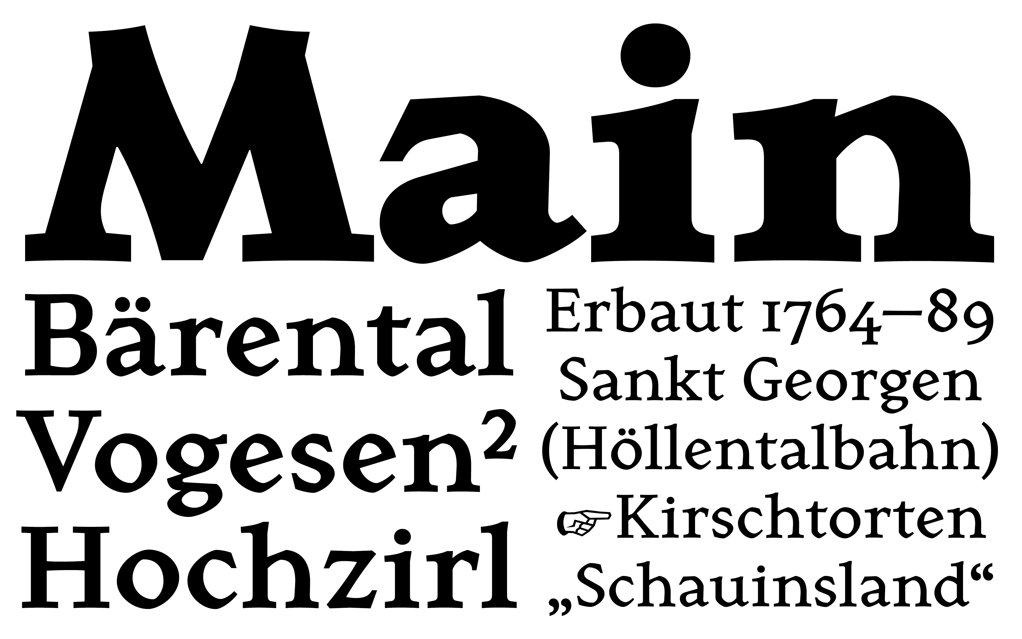
Gutach is typeface for printed text which was originally developed for a publication about primary school teacher, illustrator and painter Oskar Hoppe. To match the location and time (rural south-west germany; early 20th century) of the book, Gutach takes inspiration from the antiqua styles by artists such as Emil R. Weiß, Elisabeth B. Friedländer and Herbert Post. These typefaces mark a late and very delicate stage of gothic-roman hybrids in typesetting. The round shapes of Hoppe Antiqua resemble the construction of broken scripts, while the uprights and diagonals are romanesque. Although this contrast is quite striking, Gutach still provides a evenly reading experience and is able to function in small sizes.
Technical
Design: dito-typo
Production: dito-typo
Spacing and Kerning: Igino Marini
Release Year: 2025
Award
TDC Young Ones: Best Single Typeface 2024, New York US
Styles
Book
Regular
Medium
Bold
Black
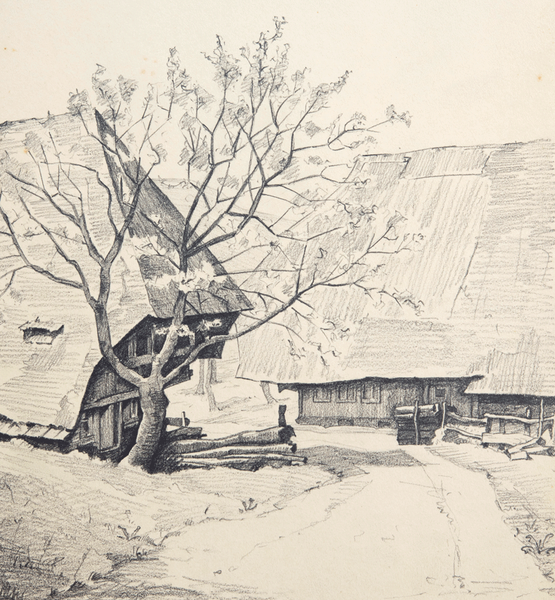
Oskar Alfred Hoppe-Holz bei Schönau (1938)
Image Source: Private collection
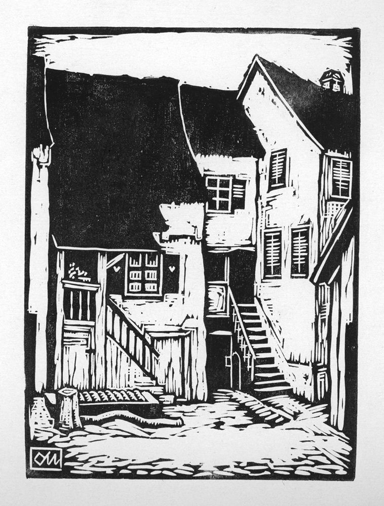
Oskar Alfred Hoppe-Hof (1932)
Image Source: Private collection
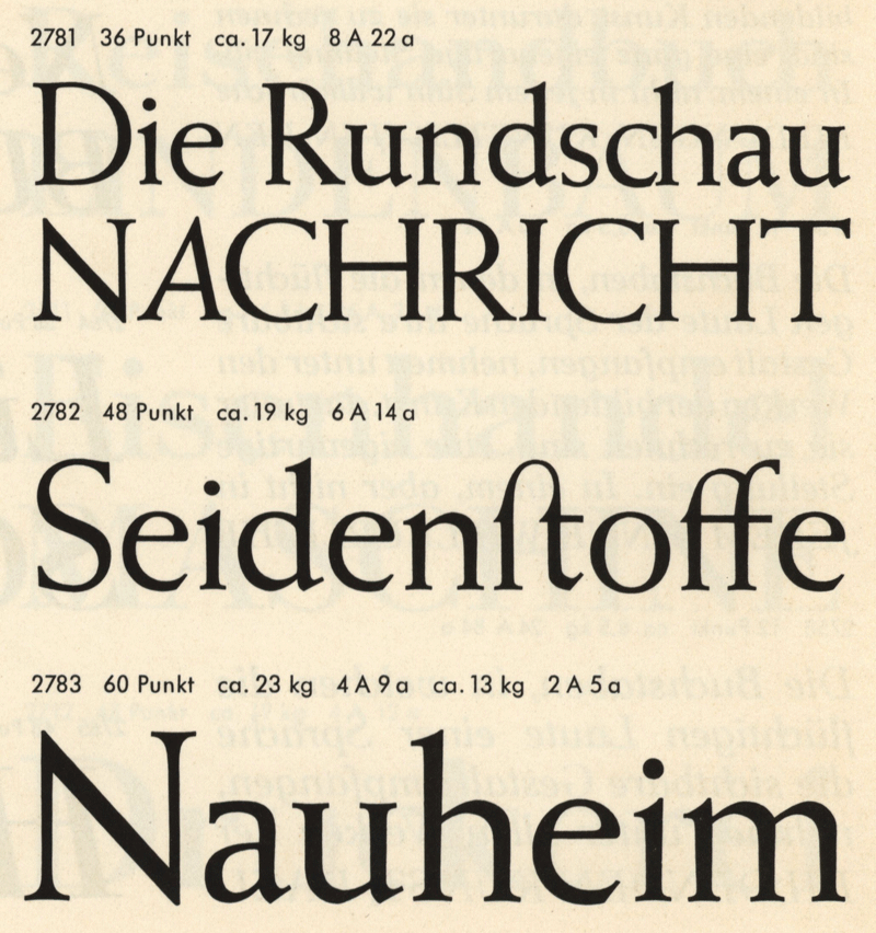
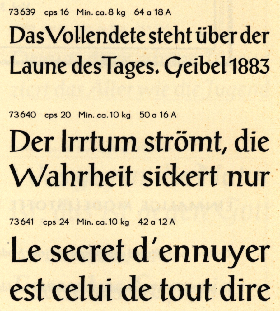
Weiß Antiqua (1928) by Emil Rudolf Weiß, published by
Bauersche Gießerei in Frankfurt am Main.
Image Source: Pavillon Presse Weimar
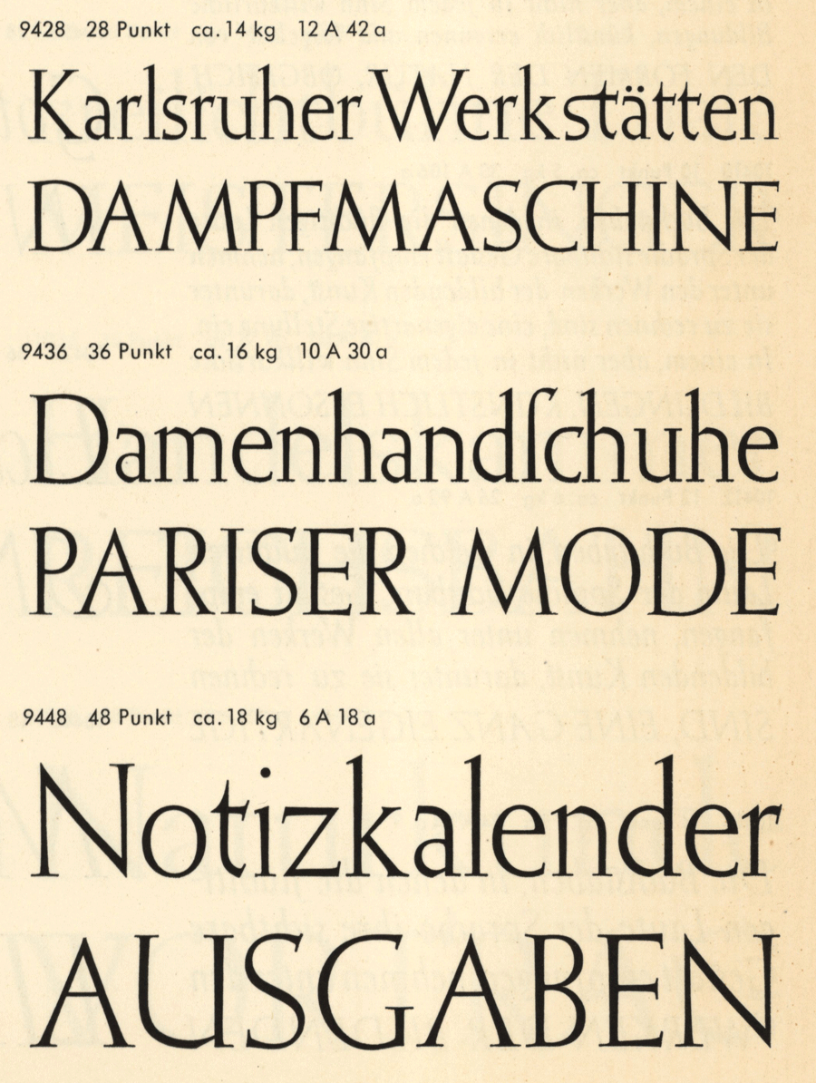
Post Antiqua (1932) by Herbert Post, published by
Bauersche Gießerei in Frankfurt am Main.
Image Source: Pavillon Presse Weimar
Elisabeth Antiqua (1938) by Elisabeth Friedländer,
published by Bauersche Gießerei in Frankfurt am Main.
Image Source: Pavillon Presse Weimar
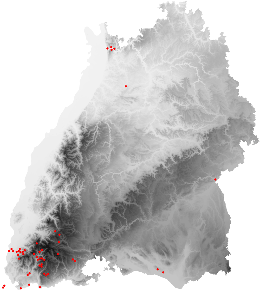
Height map of the federal state of Baden-Württemberg
with Oskar Hoppes drawing spots.